

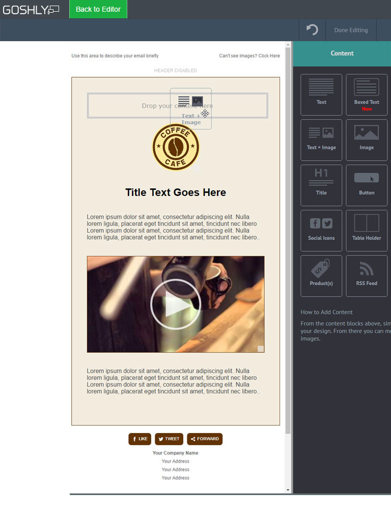
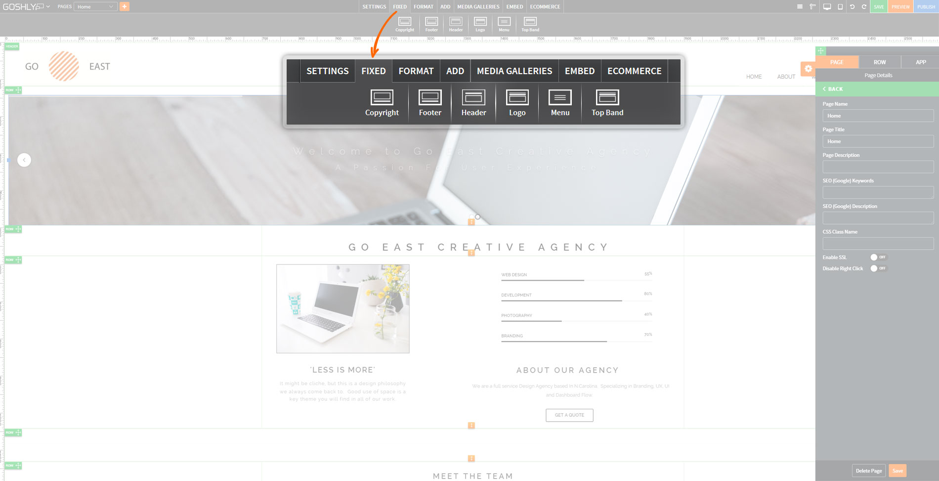
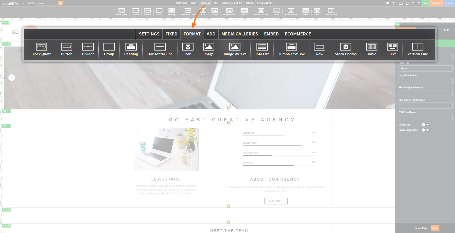
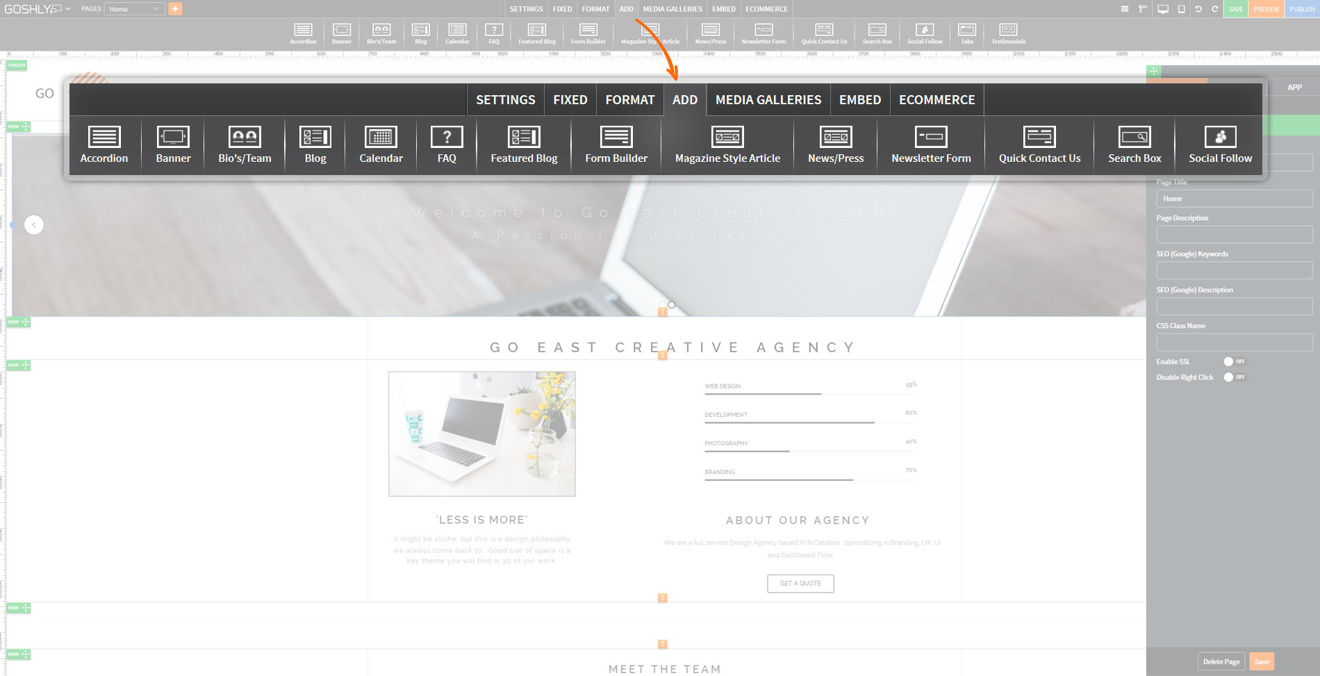
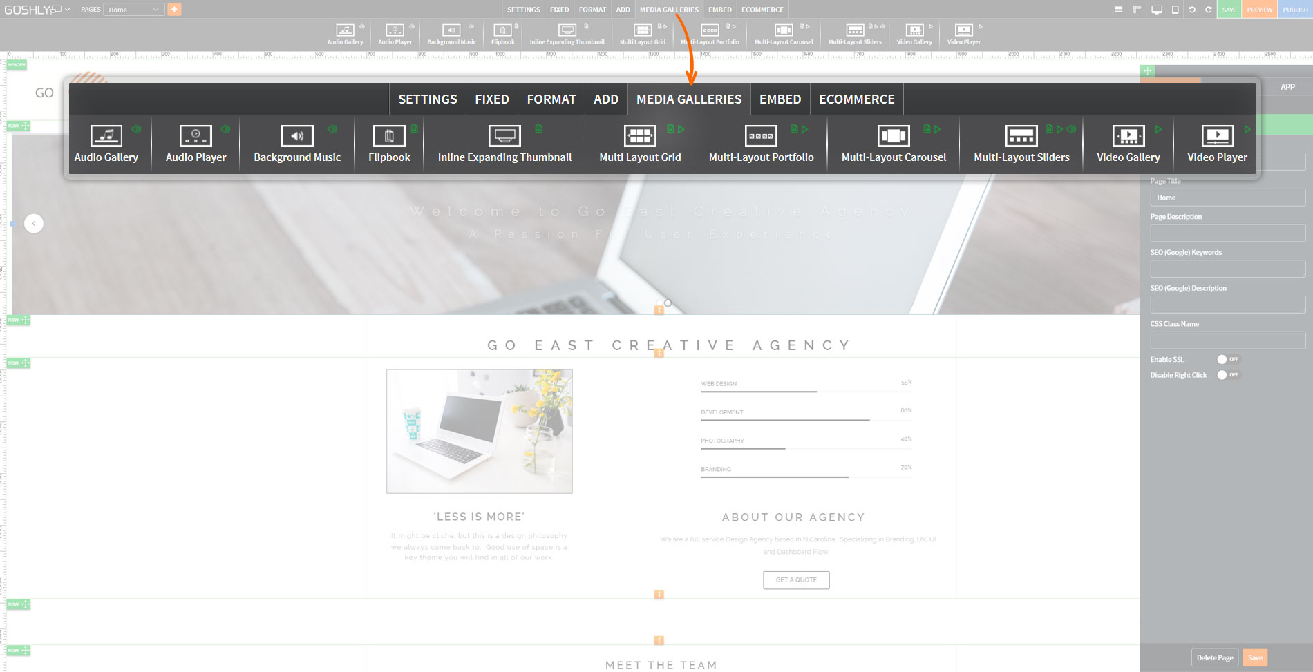
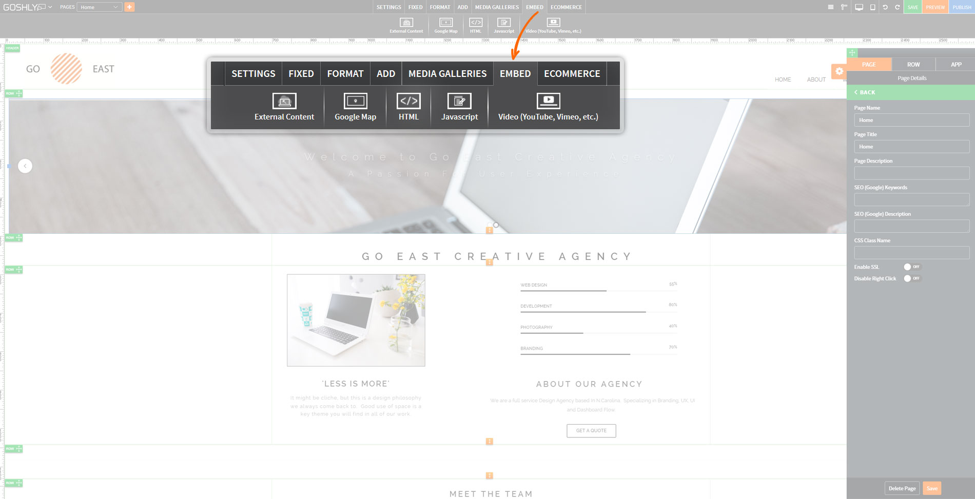
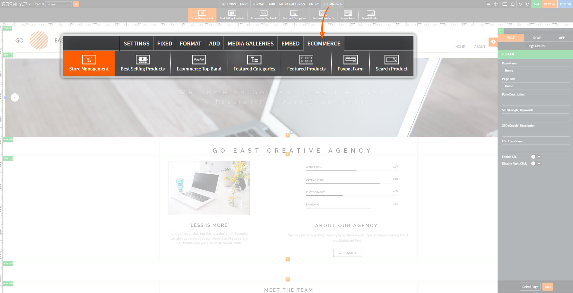
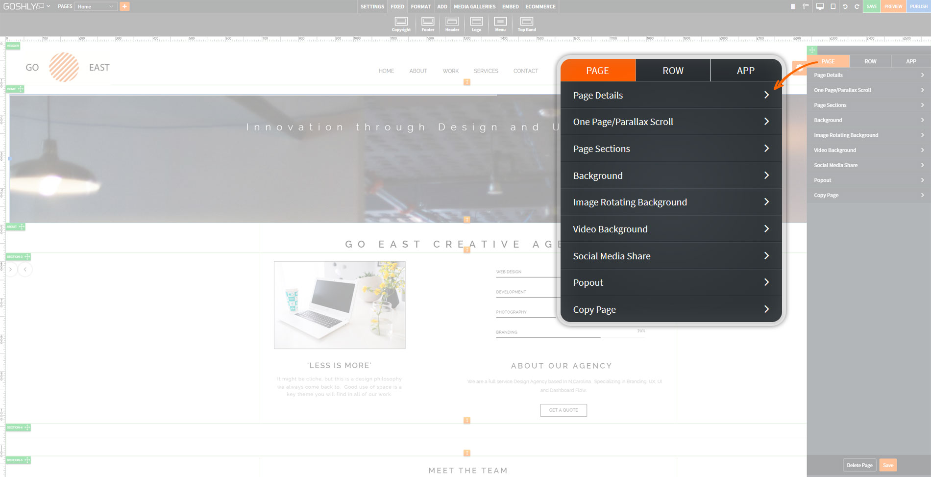
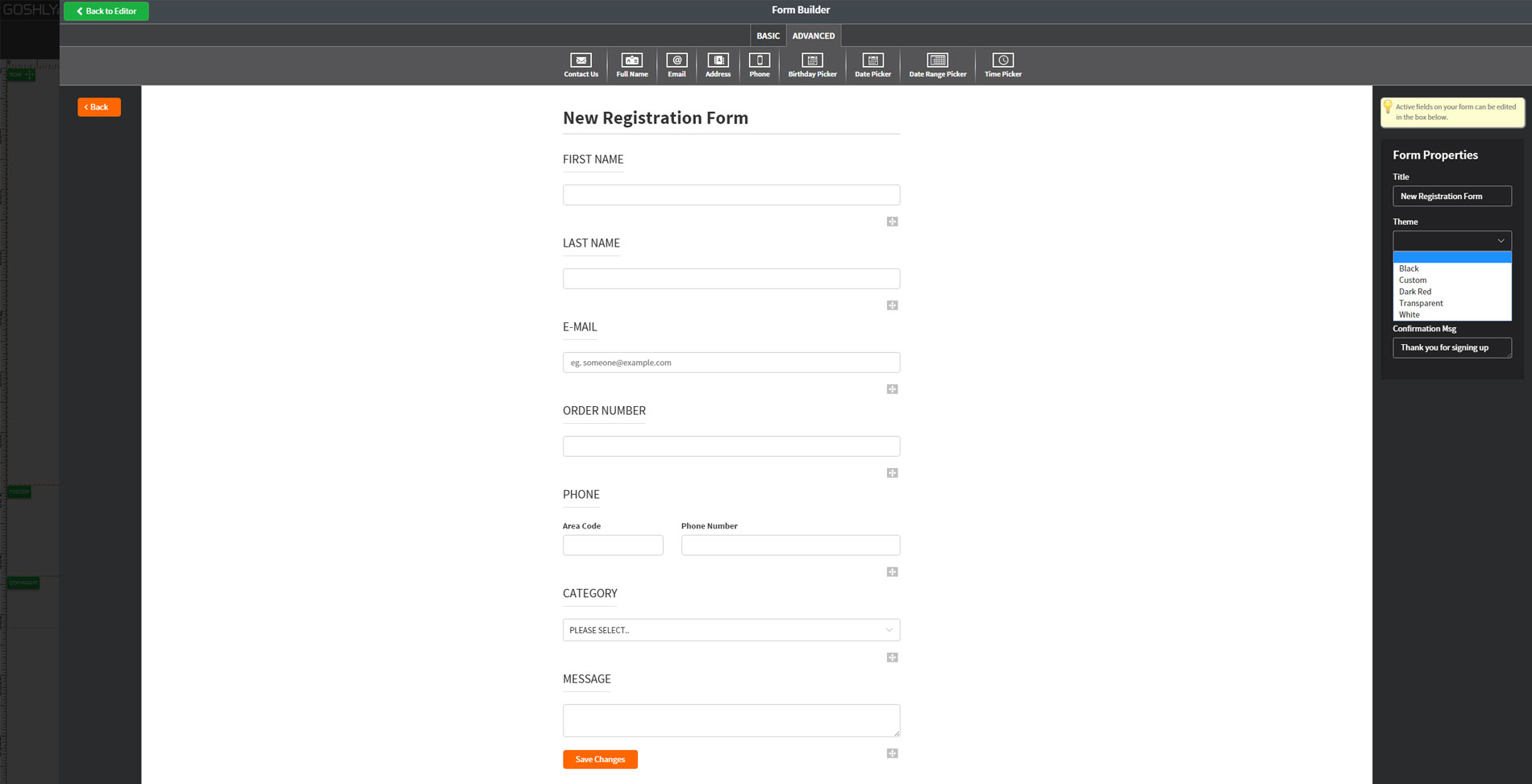
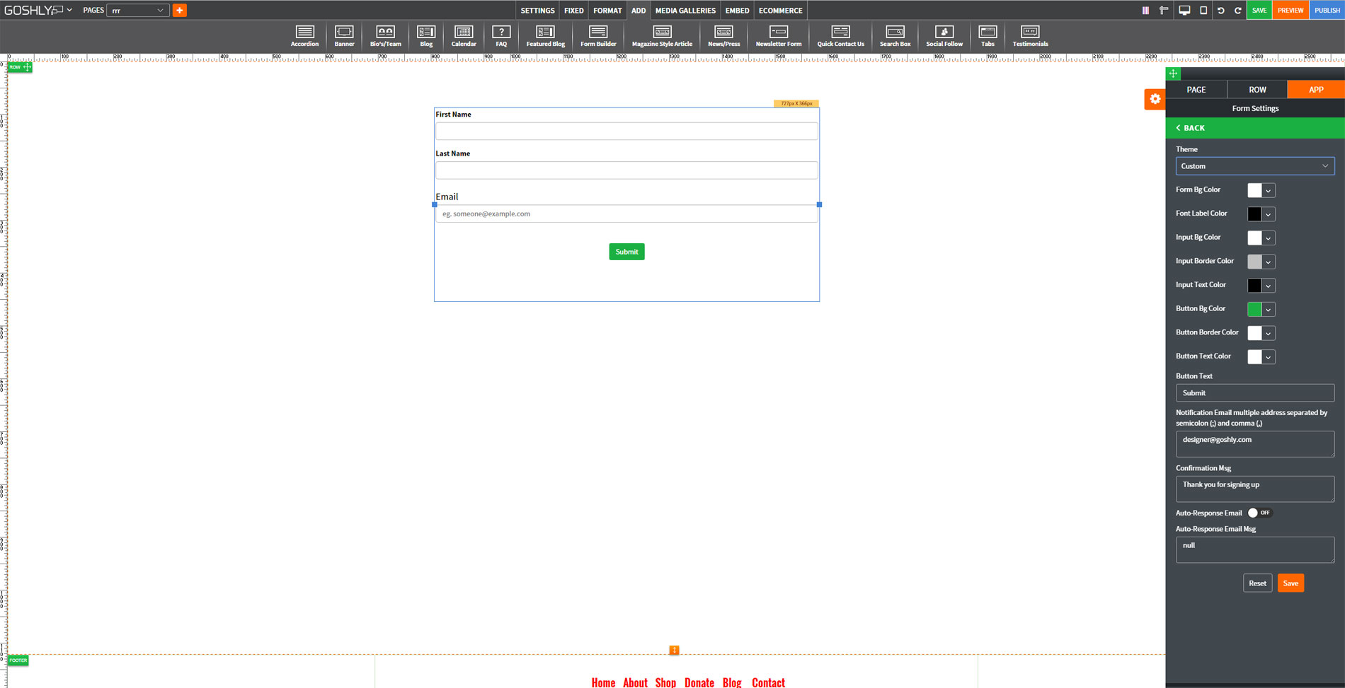
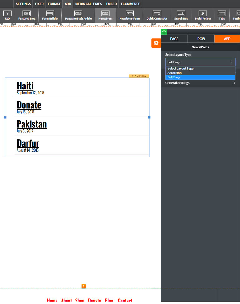
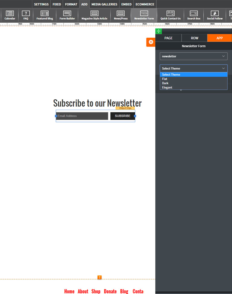
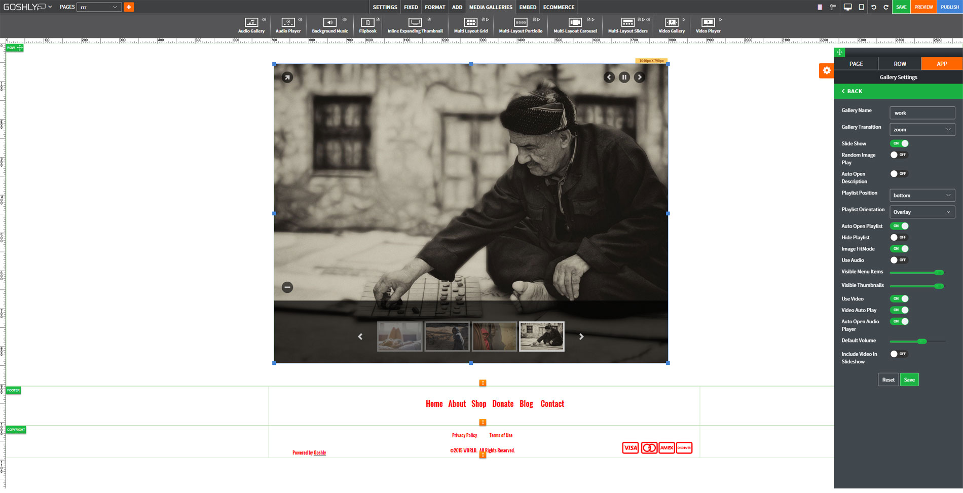
Other Website Builders require you to work in a restricted 'playbox' whereby elements outside a 'fixed' area on any page. They do this because it's very difficult for Websites to be 'Responsive' when allowing elements to be drag and dropped across the full width of a page.
We developed a complex algorithm whereby every single pixel of movement is plotted in the background. This allows free range drag and drop across the entire width of the page. This breakthrough technology is why Goshly Websites look like they were designed by a high-end agency for several thousand dollars!


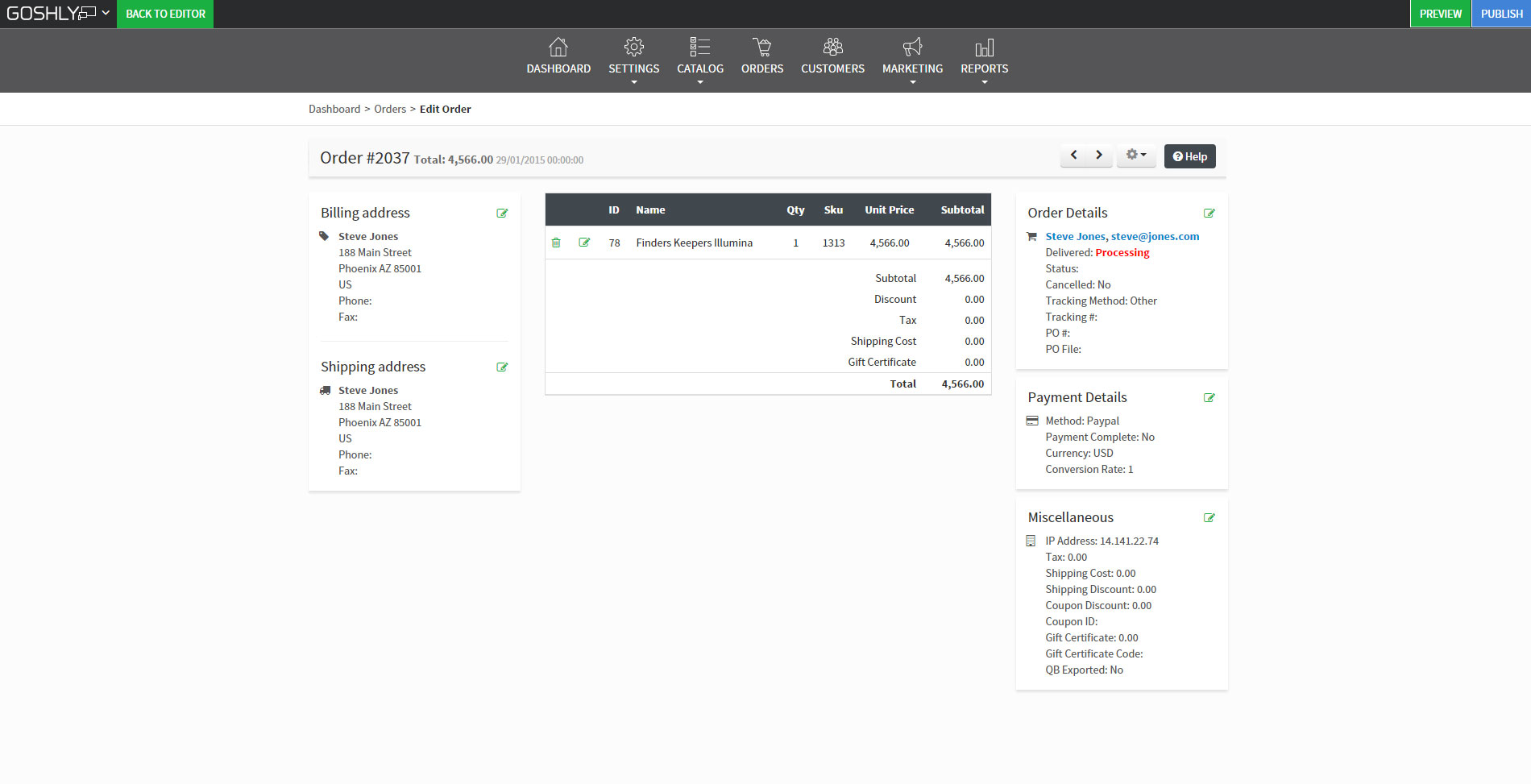
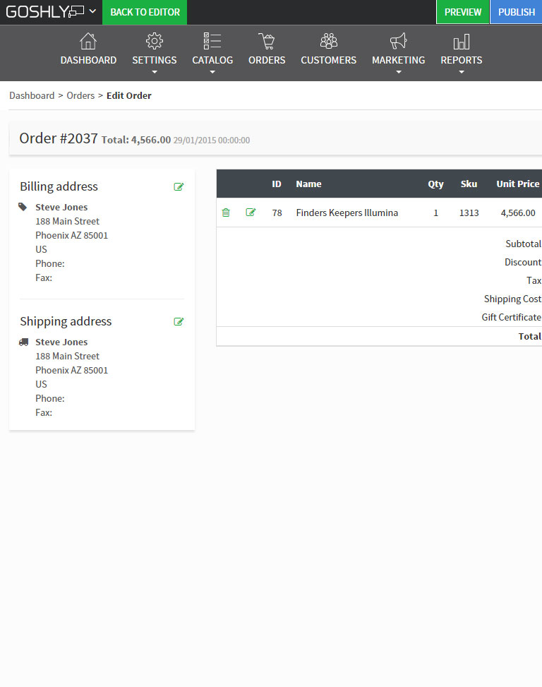
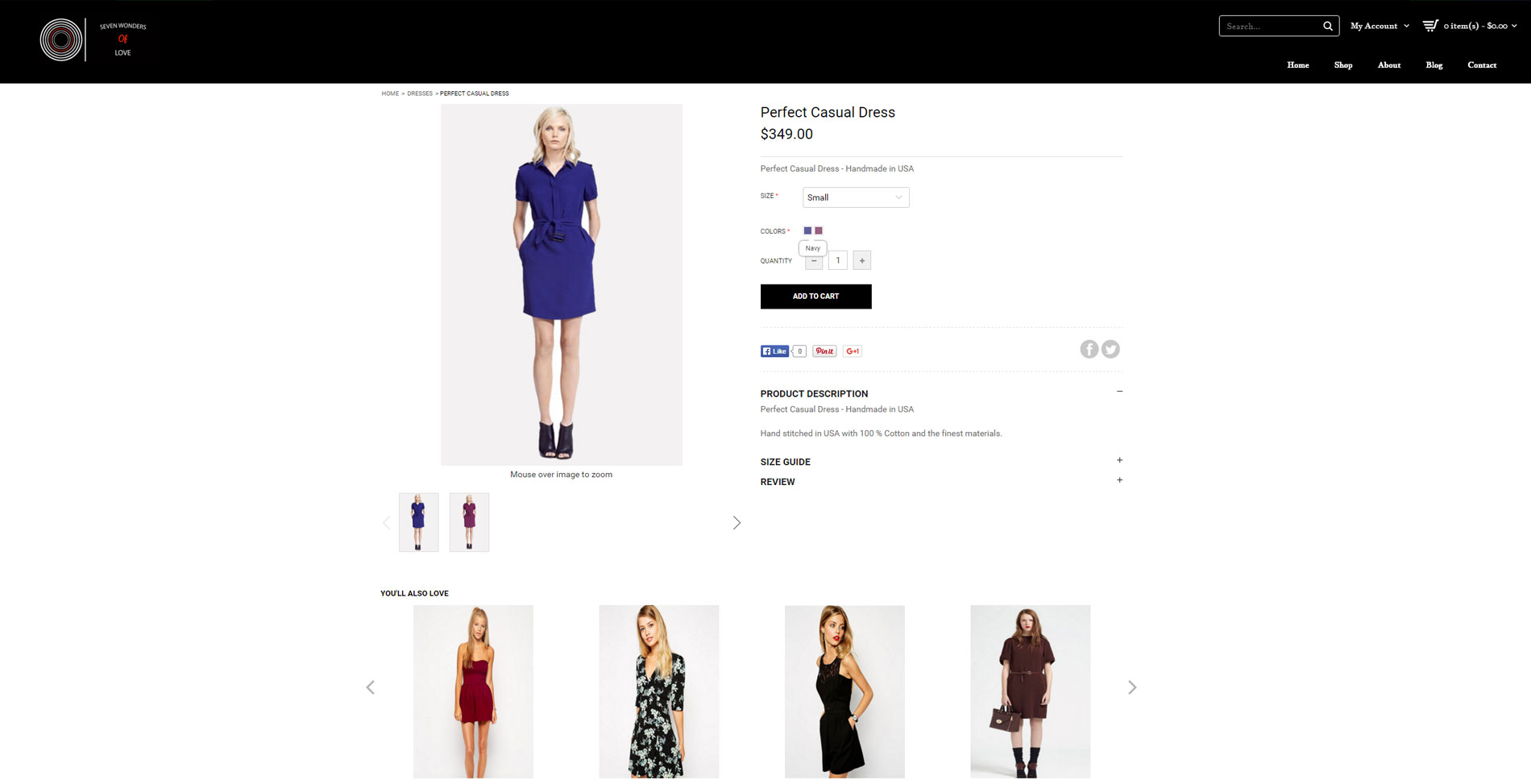
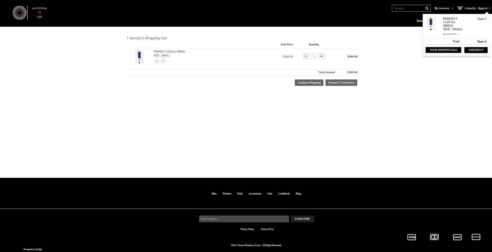
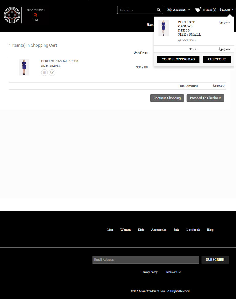
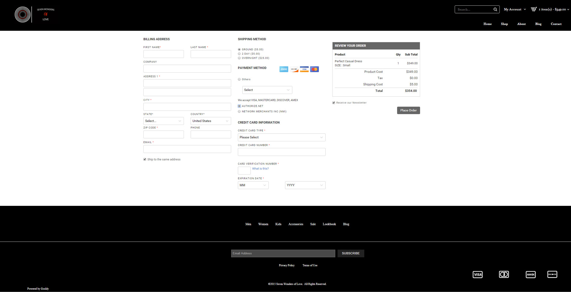
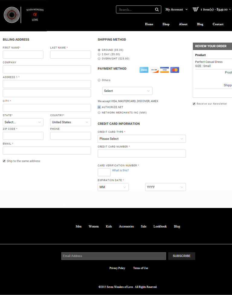
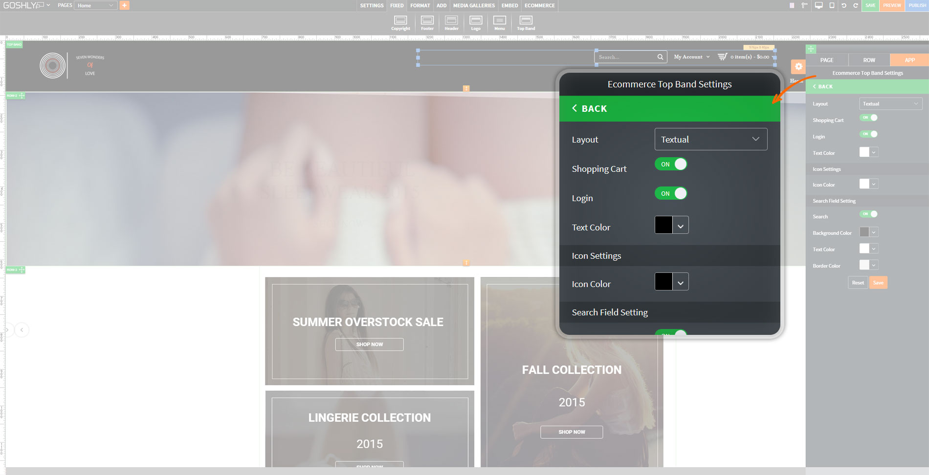
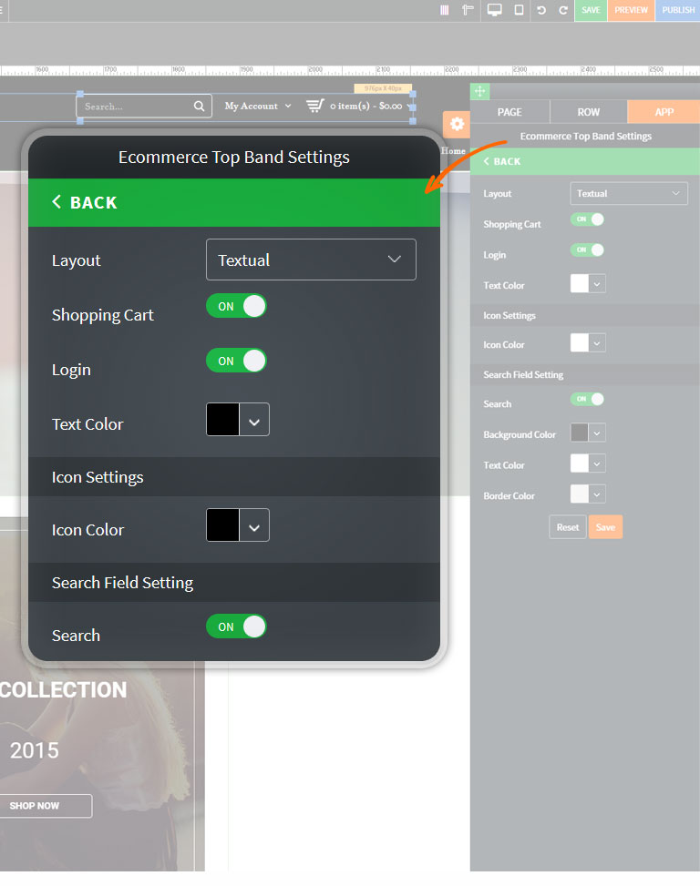
Cutting-Edge Checkout

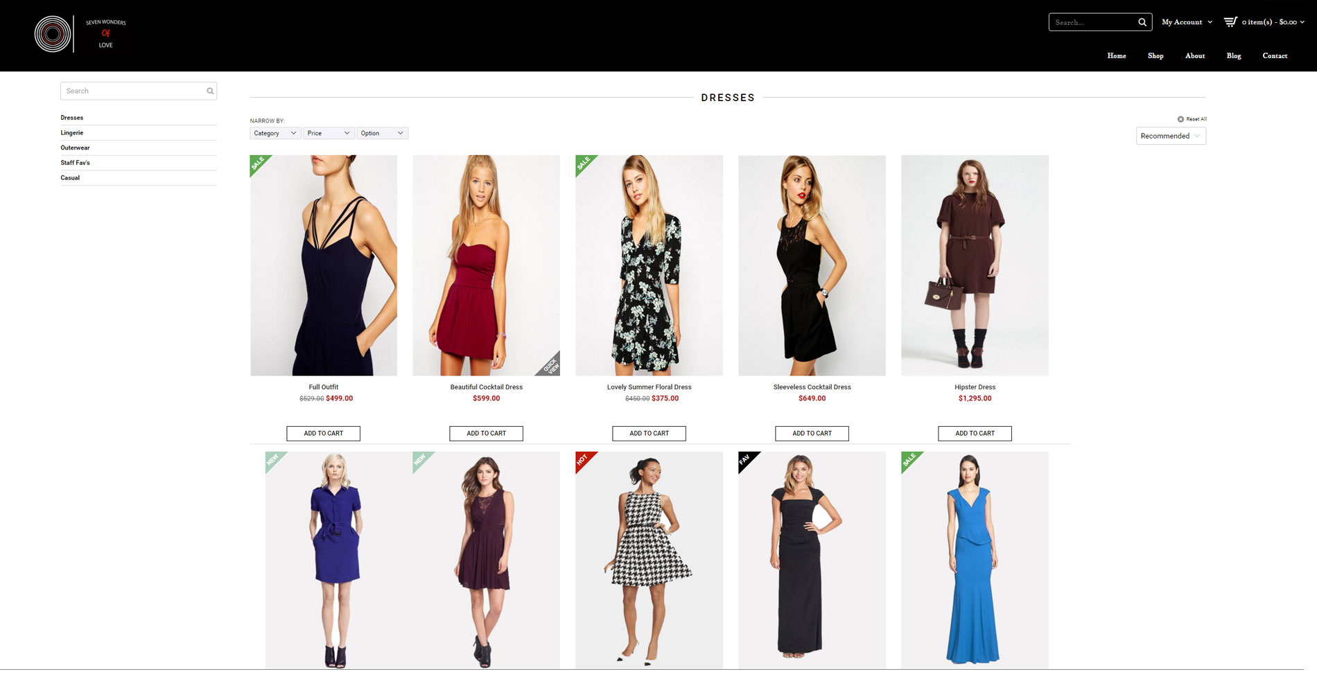
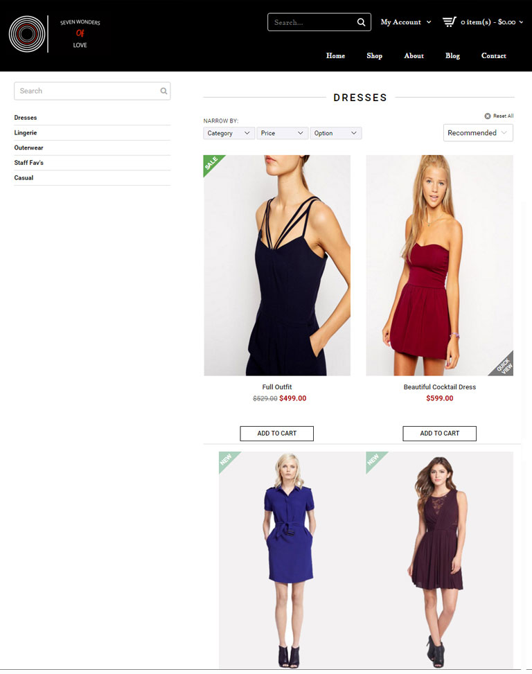
Beautiful Products Display

Highest 256 bit SSL Security

Inviting Large Product Images

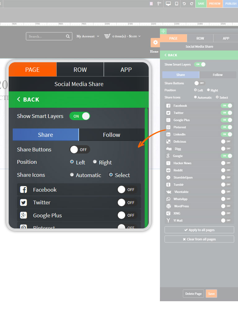
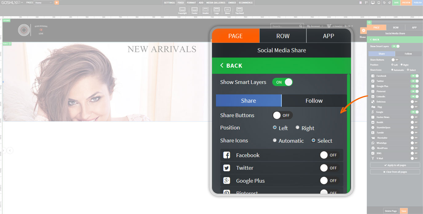
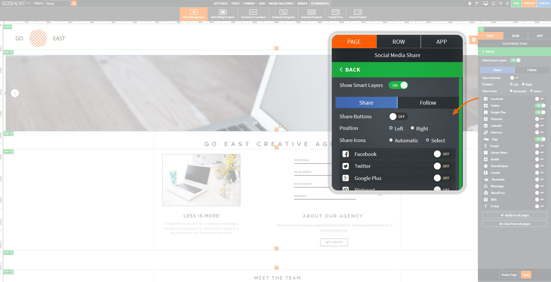
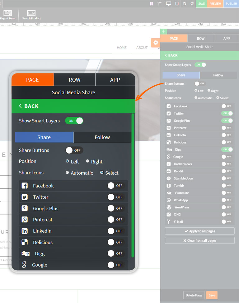
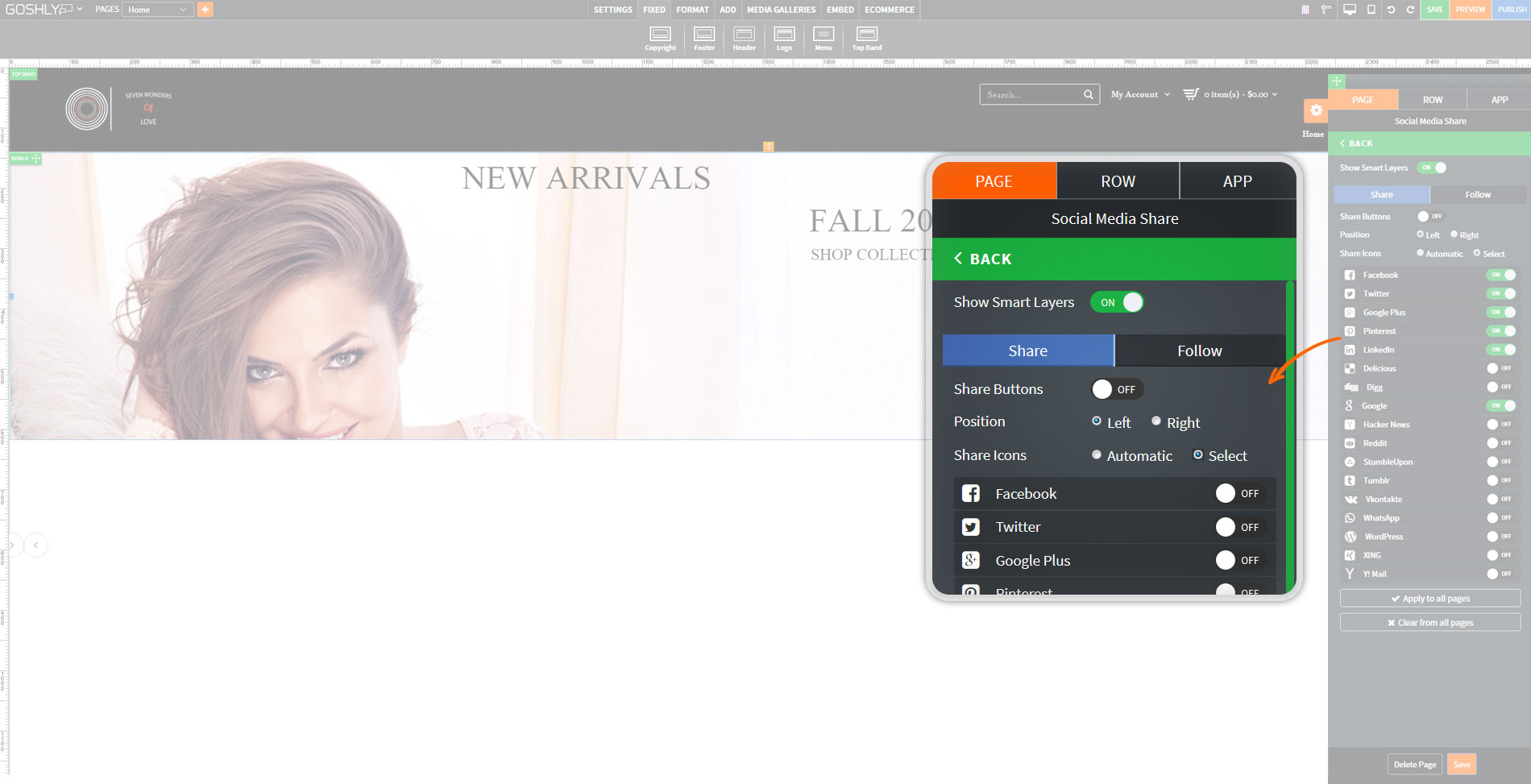
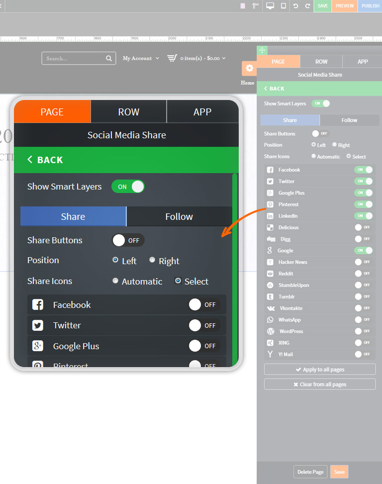
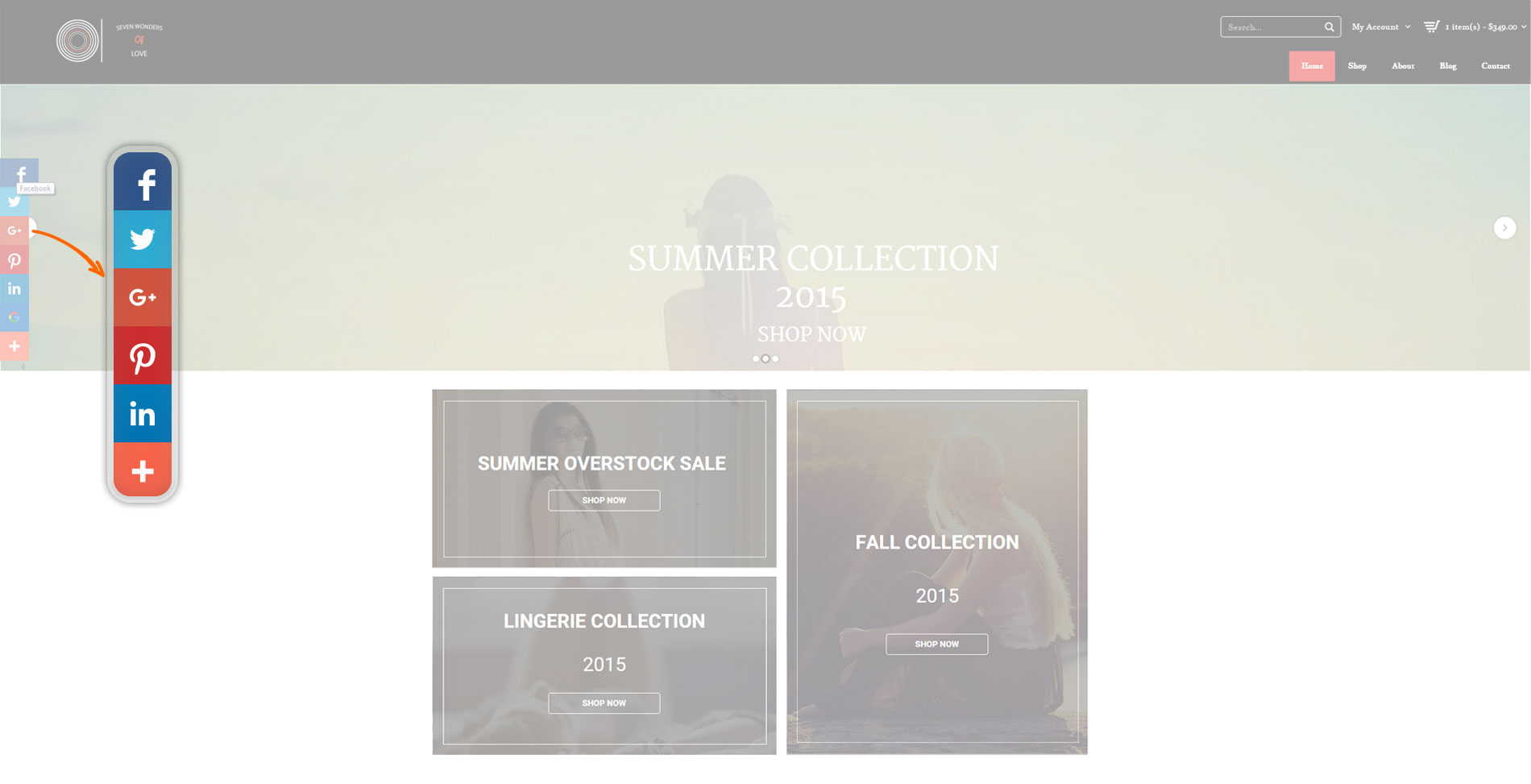
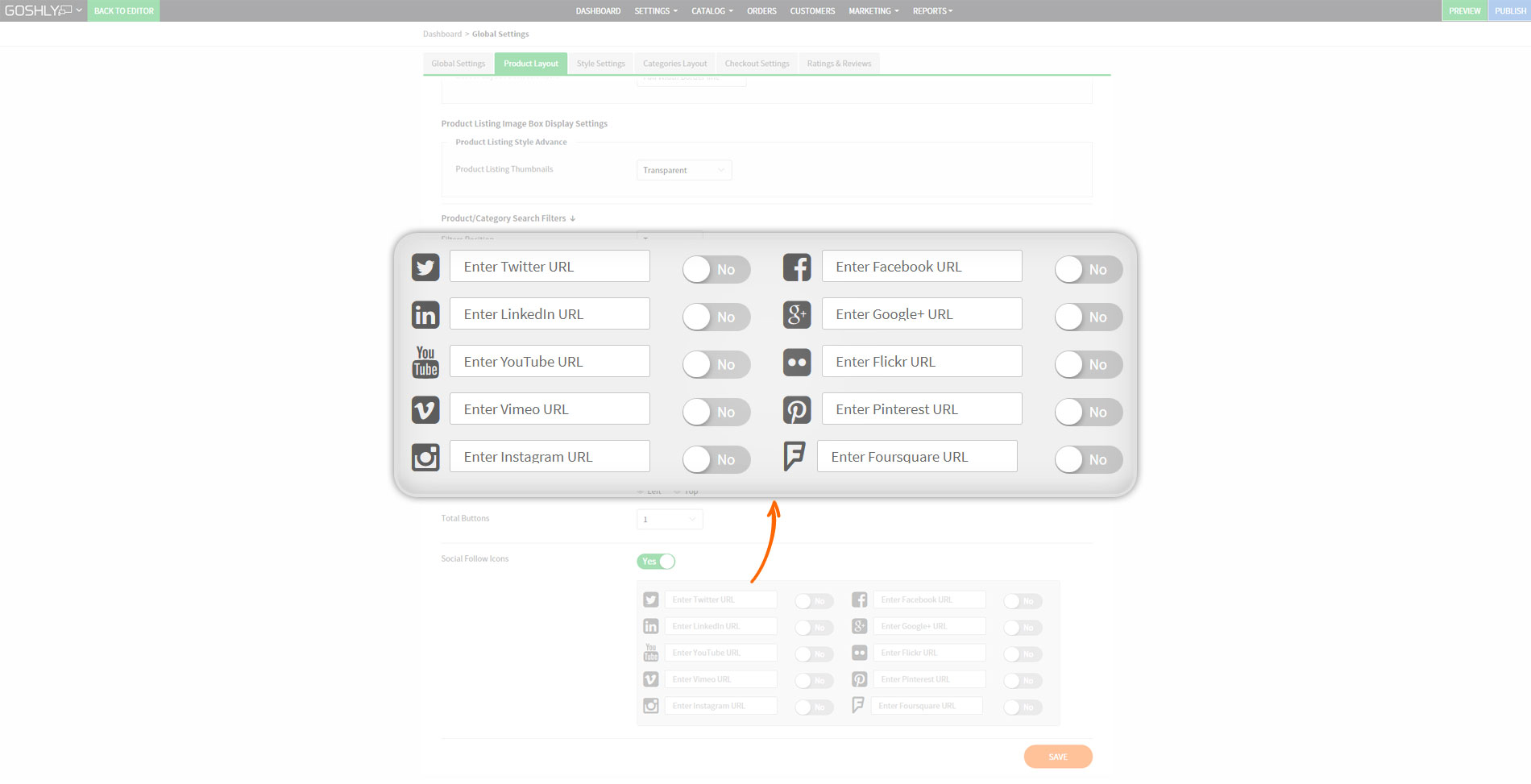
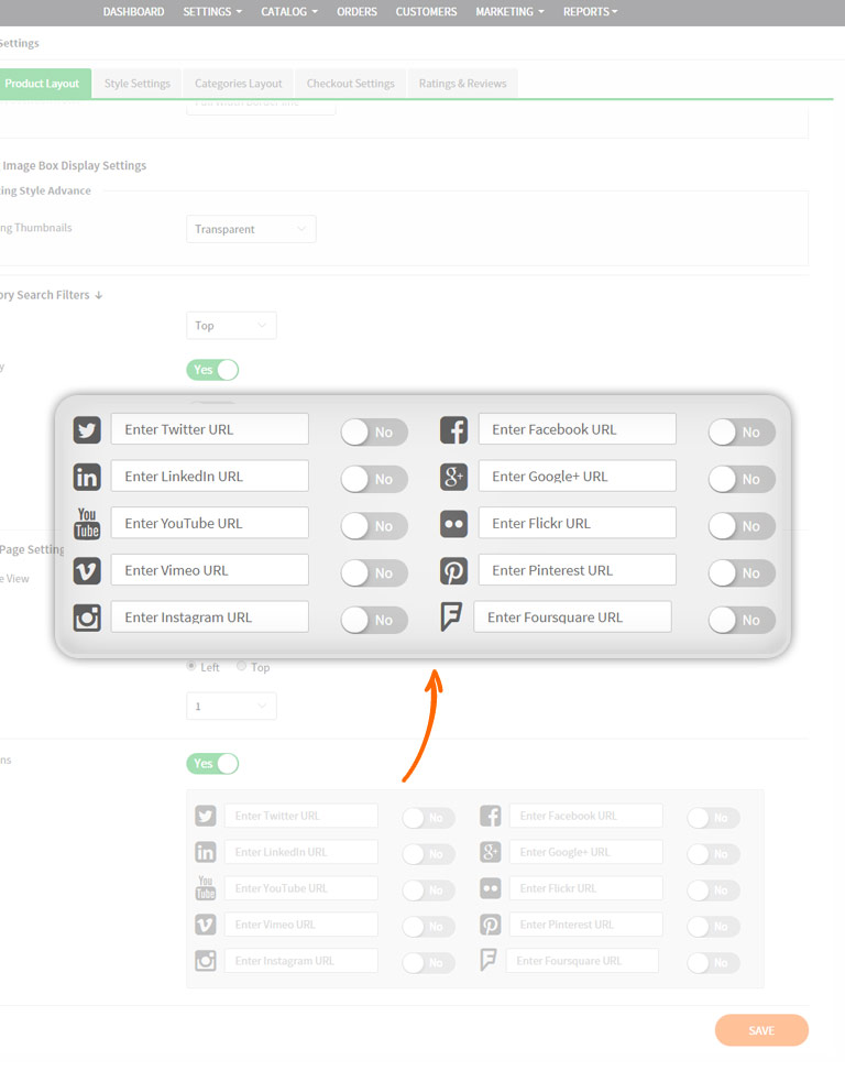
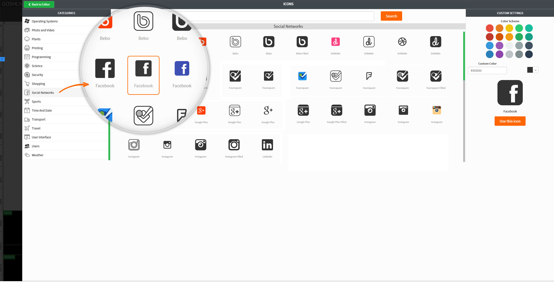
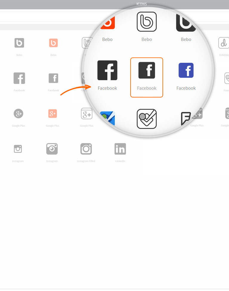
Integrated Social Shares & Likes

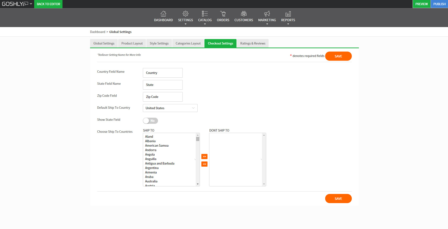
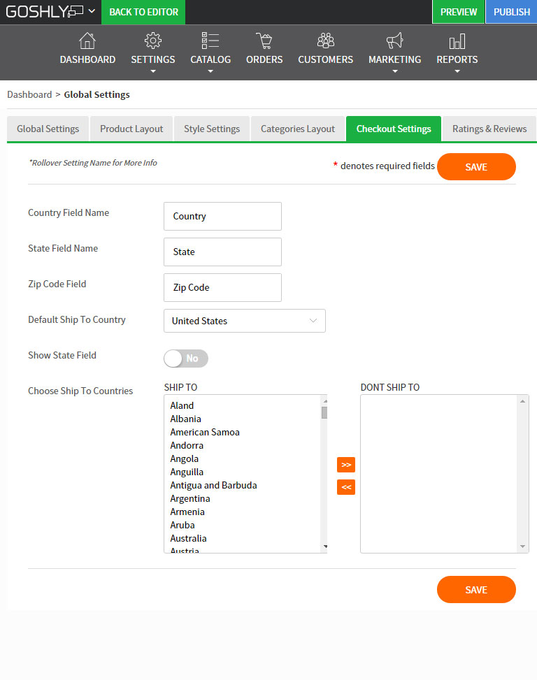
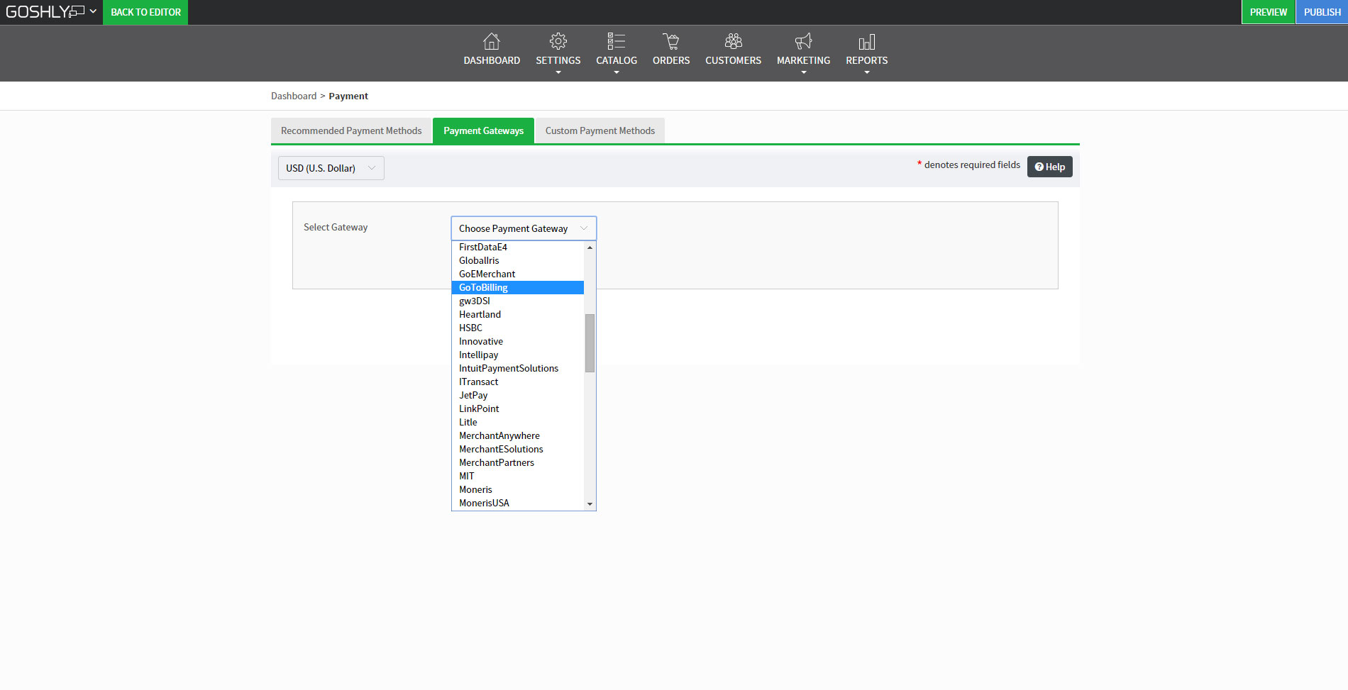
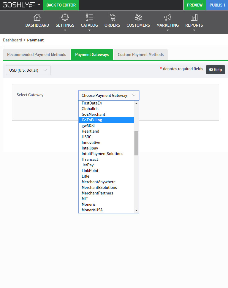
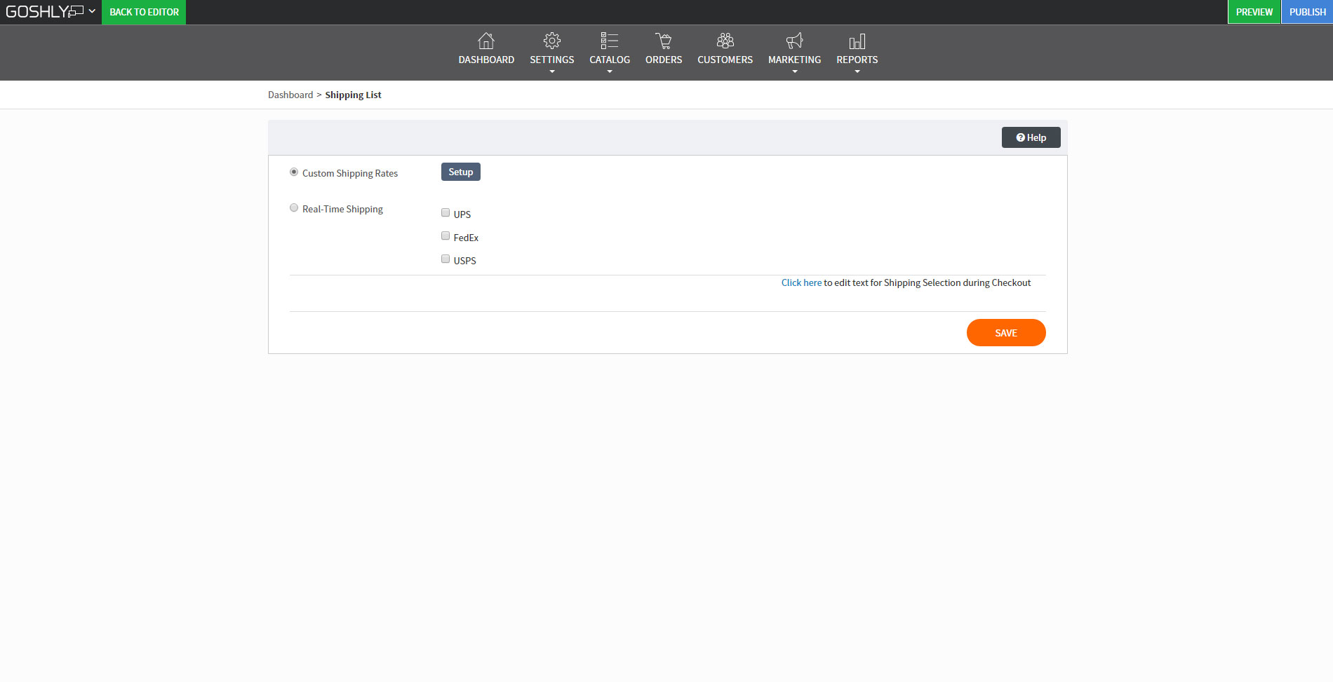
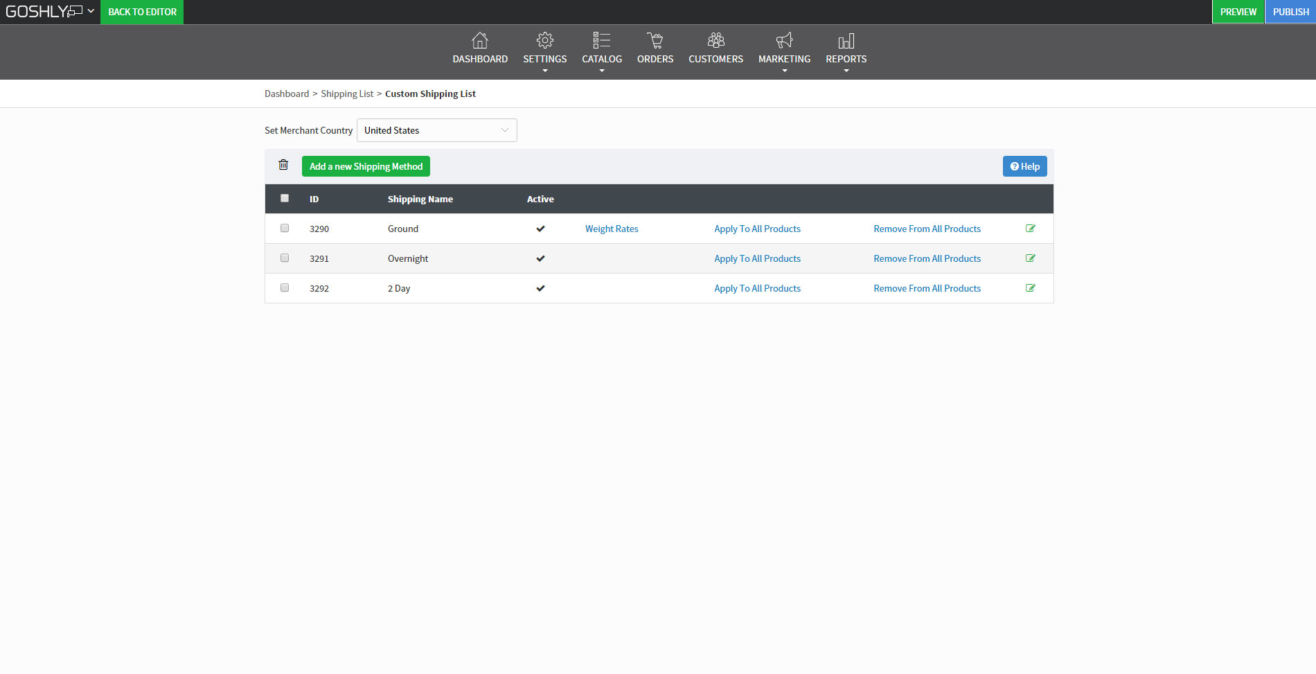
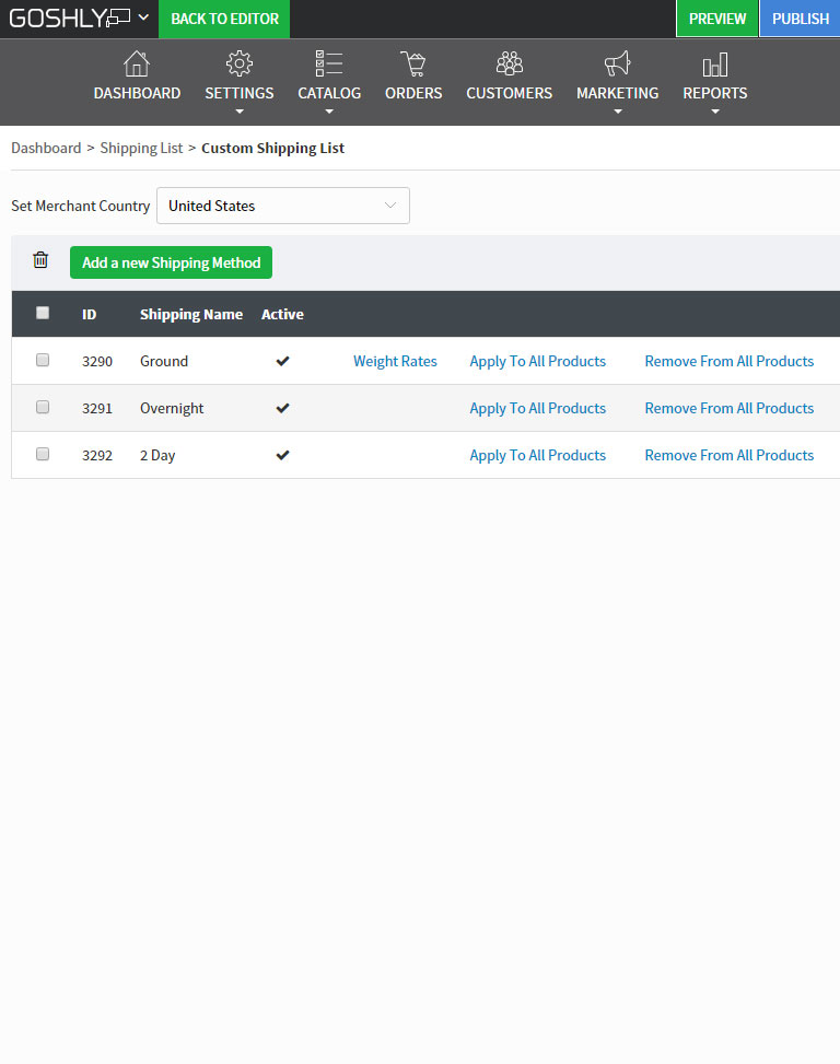
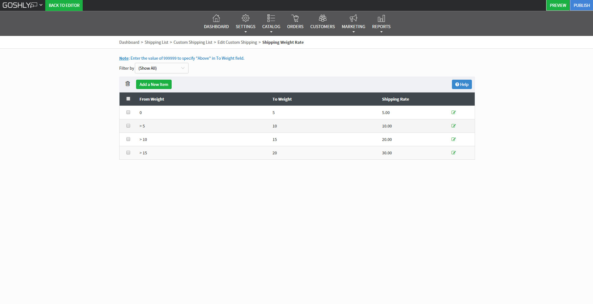
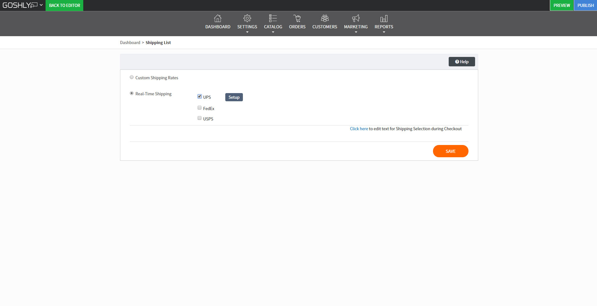
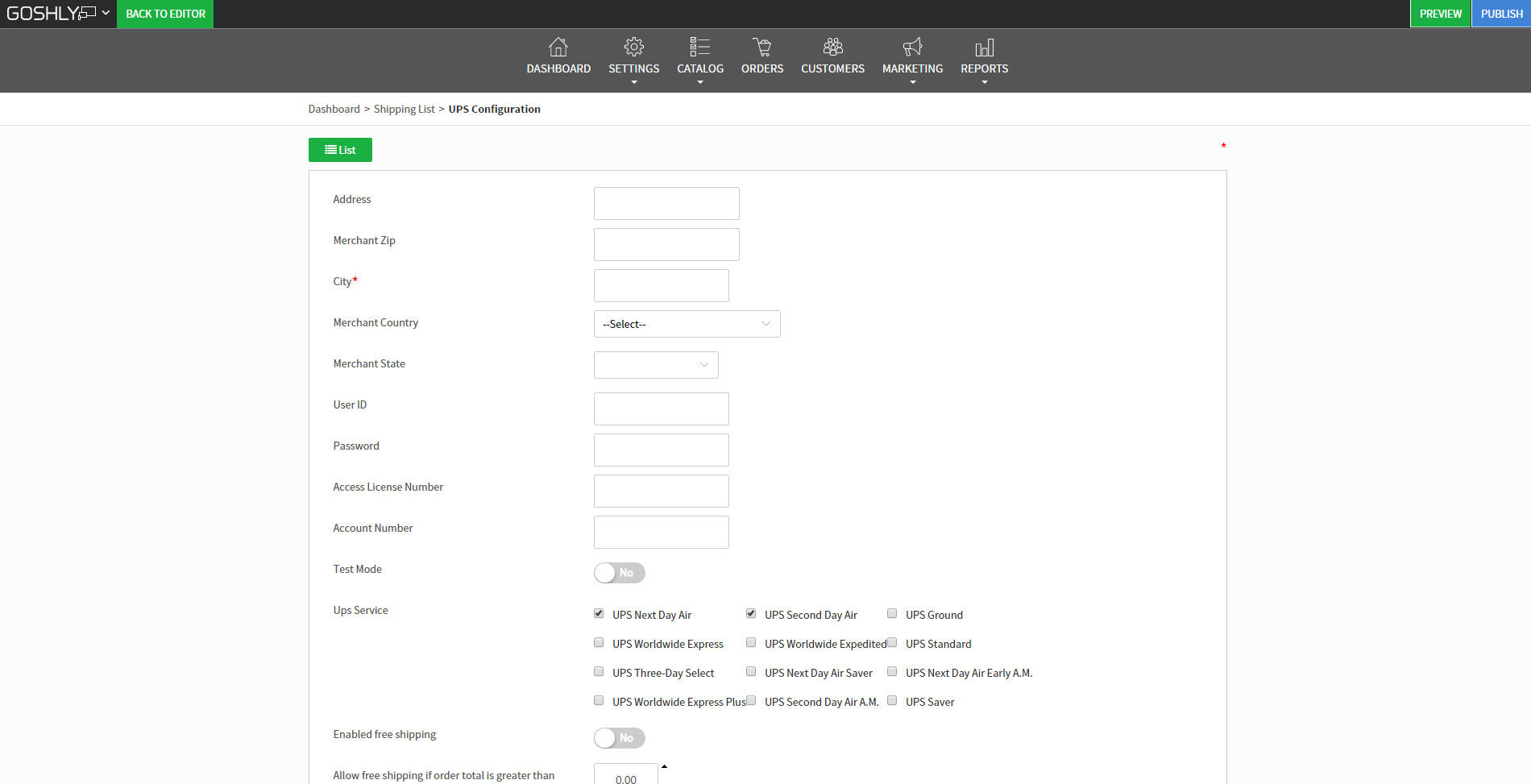
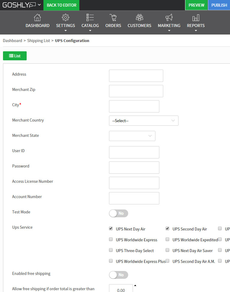
FedEx, UPS, USPS & Custom Shipping


